I really let them have it at the local yard if they draw quote markers rather than appropriate minute and second markers....just say 'no' to such vulgarities.Originally Posted by William Adams


 Contributor
I really let them have it at the local yard if they draw quote markers rather than appropriate minute and second markers....just say 'no' to such vulgarities.
Bumbling forward into the unknown.
 Contributor
No kidding - that same crowd does not know what a fish knife is for, nor which fork to use for desert. Cretins. We have standards that must be upheld.
When I started woodworking, I didn't know squat. I have progressed in 30 years - now I do know squat.
Contributor
Nothing a proper flogging can't change.
Bumbling forward into the unknown.
Member
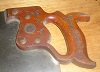
The tools in the Studley chest were listed in a Fine Woodworking article about twenty years ago. I was able to find the listing on line also. I do not think that even half the tools are woodworking tools, and Studley worked in the machine tool era.
Unlike the Phyfe chest and the Seaton chest, the Studley chest does not seem to be any thing like a reasonably complete set of woodworking tools. There are 12 skew chisels, but only two other chisels of any kind. Hard to believe they were the only chisels he used. Only one mallet. A fancy mortise gauge, but no mortise chisels. Turnings on the chest, but no turning tools in the chest. No plough, no fillister, no rabbet plane of any sort. No fret saw, turning saw, or keyhole saw.
I think this chest is just a display case for some of Studley's nicer tools. The chest is clever and nicely made and the tools are very nice. Some of the individual tools are well worth a close look, but I question the historical importance of the inventory as a whole.
 Contributor
What I don't get is why do they have it hanging next to a door that swings towards it?
https://m.youtube.com/watch?v=6cGNT-RSkEU
 Contributor
William, I am not trying to dismiss your complaints by authority. I do not claim to be an authority on publishing or typesetting.You tried to dismiss my complaints by arguing from authority ( http://rationalwiki.org/wiki/Argument_from_authority ) while dismissing terms which can be found in any dictionary:
If your original post mentioned you having the book and finding inadequacies in descriptions of the tools, the discussion may have been completely different.
For clarity - The original post did mention receiving a copy of Virtuoso.
My point is most people will tune out if a discussion gets to the point of them having to look things up in a dictionary. Many years ago widows, orphans, rivers and such were not seen in most professionally set type. Some still crept in.
With the advent of computers many folks have done their own publishing. Today's publishers do not share in the knowledge or disciplines of high end typesetters from a half century ago. The cost of having high end typesetting is likely one reason why so many people went with self publishing. Funny how Lost Art Press is involved in the lost art of woodworking and the art of publishing is another of the lost arts.
Please forgive me if I have upset you.
My intention is to enjoy the book for the information it conveys. I will not likely be upset about having to turn a page to finish a sentence. Nor will I hold the people at Lost Arts Press in low esteem for not being skilled in the art of typography.
Most people are happy just to be able to get an apostrophe or quote marks and use them for everything. When it comes to special characters many people either are not aware of them or do not know how to create them on their computer.It is really sad if in a group of people who handle dimensioned material and a significant subset of whom do signage that they don’t know the difference between:
5' 2"
and
5′ 2″
jtk
Last edited by Jim Koepke; 05-23-2015 at 9:41 PM. Reason: For clarity
"A pessimist sees the difficulty in every opportunity; an optimist sees the opportunity in every difficulty."
- Sir Winston Churchill (1874-1965)
Contributor
I'd hazard a guess that few of us care about the typography Mister Adams - even in a $50 book. For example, I want it to understand his clever storage ideas. But if you're one of the folks who DO care, why not simply return the book and include a letter telling them that their typography lacks appropriate sophistication?
Also, lay off of Mr. Koepke. He's a nice man.
Last edited by Frederick Skelly; 05-23-2015 at 10:31 PM.
[OP]
Member
It would have been a brief bit of work to’ve set the paragraph formats so as to’ve eliminated the orphans (there may not be any widows, didn’t notice them at a quick check through the book). Similarly, computerized typesetting make it quick and easy to examine all special characters and replace them w/ the proper ones.
Most egregiously, the setting of the dimensions make it more difficult to recognize them, since the fractions are shilling style and separated from the whole number by a hyphen.
If typography doesn’t interest you, please skip all of the following save for the last paragraph. Thanks.
Hopefully, someone at Lost Arts Press will take the following as constructive criticism:
Orphans: pgs. 4, 5, 32, 40, 52, 55, 60, 189, 194 (also an atrocious break (...ev-//er-new...)
page bottoms are ragged / not flush, so no reason for such, similarly, no formal grid, so it’s bizarre that they put the first line of a paragraph above two images on pg. 62, then continue the paragraph below them. Similarly on pg. 80, identifying head for Center Gauge appears vertically high than the matching photo, while the same for Drill gauge is pushed down below (on pg. 86 the same elements are consistent — heads are higher than matching photographs, but on the facing pg. 87 they’re inconsistent again). Lots of trapped white space throughout (e.g., pg. 106).
Bad breaks: pg. 27 top (...compa-ny logo.¶), pg. 33 (hyphenated a 2 line paragraph), pg. 76 (... “Russell Jen-nings.”¶), pg. 155, last line of second paragraph is (was.”), pg. 192 (...an ev-//er-flowing...), pg. 193 (...many of//us). The index formatting is beyond bad — I’m fairly certain it’s InDesign’s defaults w/ no adjustments and set in two too-narrow columns. It also ends on a short page, just 7 lines in a single column, almost over-whelmed by the furniture (book title and folio in the upper left corner of versos).
Also fractions are set as shilling style: 1/8" (pg. 56), w/ a hyphen if after a whole number (pg. 59), a lowercase “x” is used to indicate dimensions rather than the proper symbol, × (pg. 57)
It’s really a shame that the micro typography couldn’t be as perfect as the text, the photography, or the tool chest which is the subject of the book.
Contributor
This is, without a hint of doubt, the most singular thread I have read in all my years lurking and contributing at SMC.
When I started woodworking, I didn't know squat. I have progressed in 30 years - now I do know squat.
Contributor
My dictionary says that can mean exceptional, strange or unique.the most singular thread
Guess it could be all at once.
jtk
"A pessimist sees the difficulty in every opportunity; an optimist sees the opportunity in every difficulty."
- Sir Winston Churchill (1874-1965)
Contributor
Switch to the thesaurus........even better there...peculiar, bizarre, unprecedented...........
And, this is me, sitting here all these years foolishly thinking that all the really arcane stuff came out of you neanders and your sharpening schemes. I stand corrected.
When I started woodworking, I didn't know squat. I have progressed in 30 years - now I do know squat.
Contributor
Thanks Frederick I appreciate this.
jtk
"A pessimist sees the difficulty in every opportunity; an optimist sees the opportunity in every difficulty."
- Sir Winston Churchill (1874-1965)
Contributor
Rest assured, Jim, that among Fred's estimable talents is quick-draw on the keyboard. He beat many dozens of us to the punch.
When I started woodworking, I didn't know squat. I have progressed in 30 years - now I do know squat.
Member
Good eye. Thank you.
Simon
 Member
I am starting another thread on this subject titled "Communication" in the off topic forum.
[SIGPIC][/SIGPIC] "You don't have to give birth to someone to have a family." (Sandra Bullock)
 Posting Permissions

 Reply With Quote