Page 1 of 2 12 LastLast
Results 1 to 15 of 30

Thread: Dyed Oak HF's

  1. #1
    Join Date
    Jan 2009
    Location
    sLower Delaware
    Posts
    5,464

    Dyed Oak HF's

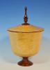
    After posting a wirebrushed and dyed red oak HF(that ended as a lamp) last week, I wanted to try again. Although there are countless styles and shapes of hollowforms that are extremely well done, they don’t always grab me to the same degree.
    One turner in particular that posts here, has many forms with beautiful and eyecatching embellishments. The foundation for all of those add ons however, is a curve that I can only describe as “sweet” from head to toe. The endgrain hollowforms I have tried, though acceptable to varying degrees, just don’t come close to giving me that feeling of "sweetness". I don’t go back and study a particular turning and try to copy it, but I did try and think about the feeling his curves give me when working on these red oak forms. None of these are there yet, but some may be closer than others. To attain that curve from the very top to the very bottom is rather elusive for me and the changes to get there are rather subtle!

    12-14-11 Blue Green Oak.jpg 7h x 5.5 w 12-14-11 Blue Oak.jpg4.75h x 4.75w 12-14-11 Red Oak.jpg4.5h x 4w 12-14-11 Dyed Oak Trio.jpg

    I already posted the first two below but I will include them again for the purpose of comparison. I don’t remember the order I initially turned these five other than the tallest one first,(and they were mixed in with lots of other types of turning over the past month and a half.) Althought the far left is Sassafras and not wirebrushed, all were dyed using black transtint, sanded back, followed by an application of another color with the following ratio’s:
    12-14-11 Dyed Oak Lineup.jpg
    Green, Blue and green 1 to 1, Blue and green 3-1, Blue, Red
    All had Bush Oil applied initially but on the far left, it was followed with 3 coats of AO, the next: 2 coats of AO, the third: 1 coat of AO. The two on the far right only have the Bush Oil.
    12-14-11 Dyed Oak Lineup Profile.jpg
    Although you are more than welcome to tell me your favorite in color, level of gloss, or anything else, I am most interested in your impressions on form. Which curve comes the closest to what you perceive to be “sweetness” from head to toe? I greatly appreciate any insight you can give! Don't feel you have to be anywhere close to a pro either to get that feeling! I'm surely not!
    12-14-11 Dyed Oak Group.jpg
    That’s it for the dyed Oak unless I turn some more and let them dry. Thanks for looking! Any thoughts or suggestions are always welcome and digested!

  2. #2
    Baxter, this is going to get interesting!!

    I love all the colors - particularly the blue/green combos, but that wasn't what you wanted to hear about! I think my view on vase forms is influenced by an overly structured attitude about many things (there are names for that condition, but we will forego those!) For that reason, I am drawn to forms that approximate a parabola or catenary in the lower body. In the sketch below, the parabola is blue and the catenary red (but, then you are a retired school teacher so you know all this!!
    troche04.06.04.gif

    In the first pic of the grouping of five, IMO the second tall green vase comes the closest (but I think the shoulder is too high), and the fourth green/blue combo is a close second (because of the better (IMO) shoulder placement, I like this one best.) For my tastes, the others are too heavy in the curvature.

    But, I think you will get positive responses for most all of them as it seems to be a very individualized preference thing.

  3. #3
    Join Date
    Apr 2007
    Location
    Georgetown,KY
    Posts
    1,106
    There's not a single clinker among them! Each form has individual attributes, but I like every one.

  4. These are really nice, Baxter! Each has a good form.............now, if one is most concerned with conforming to some rule.......although touted to be the most pleasing to the eye.............I still think that in a grouping like this one you have done, that the variety speaks of something more than adherence to a rule of form. If they all adhered to the rule of form, then a loss of interest would ensue in my opinion.

    I like where you are going with these............I could see numbers of "purposeful" applications such as the lamp you did......this would give a chance for any home's decor and the ladies of the house would likely keep you at least engaged with this technique for a good while making things for friends that saw it and say "can I get you to make me one of those.......only in _____________ color?

    N-I-C-E!!!
    Remember, in a moments time, everything can change!

    Vision - not just seeing what is, but seeing what can be!


  5. #5
    Baxter, I saw the same thing John saw, so I was happy that I knew intuitively 'what's sweet' or approaches 'sweetness.Now I'm going to have to look up catenary. Sometimes while sitting in my chair, and i'll grab a pad of paper[without lines] and i'll start drawing curves, one right after another.It's amazing, how a small tweak can make that subtle shift that pleases the eye.After i have free-handed 25+ profiles[from the foot to the lip] i'll give it the 'eyeball test' and reject the rest.Another aspect of this,is to try a left and a right profile.then experiment with the space between them.I've noticed that also makes a huge difference.sometimes you get the profile right but width wrong. make a left and right profile you like,on paper.cut it half from top to bottom,and begin to move the profiles together and apart.It will be obvious when you see it. Rob

  6. #6
    Join Date
    Dec 2008
    Location
    Chesterfield, VA
    Posts
    1,332
    I love what you've turned there. I was just looking at some of my oak firewood and wondering how many forms I'm getting ready to burn...and then I see this post. I really never cared for oak, but you've sure done it justice. My only suggestion is that these things need to stay together, as a set. They're beautiful and compliment each other so well.

    Oh, and when I grow up, I think I want to turn some of these things out just like you!

  7. #7
    Join Date
    Feb 2008
    Location
    Central NC
    Posts
    492
    Baxter I'm going with the same 2 that John picked, of the first five it is no. 2 and no. 4. No. 3 is appealing until I get to the base. It's too narrow for my taste causing it as a whole to appear too bulbous.

    I've got lots of oak around but I shy away from turning it because it has spooked me in the past but your pieces are starting to give me the urge for another try. (that's my best attempt at a run on sentence)

  8. #8
    They are all good forms, the two green ones on the left are my favorites but it was a tough choice. The wider blue one came close to being my top choice but its bottom is tucked in more than I care for. This is just personal choice, you should be proud of any/all of them. I agree that small changes make the difference between good and great but my only suggestion is for you to pick one (or more) of these and try to copy it with planned small changes.
    _______________________________________
    When failure is not an option
    Mediocre is assured.

  9. #9
    Join Date
    Jan 2010
    Location
    Lewiston, Maine
    Posts
    1,506
    Baxter, I shouldn't have read the previous comments before replying to this. The 4th and 2nd, in that order, are the most pleasing to me. I have to agree that the shoulder on the 2nd could drop to make it "sweet". I really like all of the colors, and the oak grain with the black dye really help highlight the grain. My apologies, but the form of the red one just doesn't appeal to me. These thoughts come from somebody that hasn't even turned any hollow forms yet, so take it for what it's worth. I do think the grouping as a whole is just plain "sweet"!! Nice work Baxter.

  10. #10
    Join Date
    Sep 2009
    Location
    Enid, Oklahoma
    Posts
    6,741
    Without reading the posts above, I like the large blue form best. I like these full figured shapes as I think they show off the wood very well. I also like relatively small bottoms as I think it allows the eye to follow the curve through the foot and up the other side of the form. Even on this piece, I feel like the tightness of the curve near the very bottom should rapidly increase... That gives the form as sense of floating which I really like. That's just my personal taste and obviously shouldn't be taken as a statement of fact... Just telling you what I like.

    If I'm being hypercritical of the other forms, the smaller blue form seems a bit squarish at the shoulder and the red piece seems to flatten out a bit between top and bottom. The larger green form seems to have the shoulder set a touch high. That smaller green form looks pretty sweet to me, but it also seem to flatten just a bit right in it's midsection... I kinda want to push down on top of this one and the red one to 'squash' them just a bit.

    I think if you really want to try to isolate the form from the color and grain you might try to converting the photos to black and white and adjusting the contrast to eliminate the grain... Raffan recommends spray painting them black in one of his DVD's, but it's such a nice grouping that I think I stick with the photoshop 'painting'.

    Edit: Having gone back and read the previous comments, I'm sticking by my impressions... Nevertheless, it's interesting to see what others like and why! Great thread!
    Last edited by David E Keller; 12-14-2011 at 8:23 PM.

  11. #11
    Join Date
    Jun 2007
    Location
    Olalla, WA
    Posts
    589
    Like most others, I think the curve of the tall green is very 'sweet' but I do like the high shoulder. Gives it a rather elegant feel.
    I also picked the large blue (must be that organic influence David and I share) as my favorite though. It has the most subtlety in the progression of the curve. The small base intrigues me but not sure why. The red and small green are too round and the short blue is too flat in the lower curve for my tastes plus a rather harsh shoulder.
    I really like what you have done with the comparisons. I should do something like this to help me learn what works.

  12. #12
    Nice Baxter, the middle greenish/blue one does it for me. I really like the effect of your dyed oak and would have not thought oak would have looked that good when dyed.
    -------
    No, it's not thin enough yet.
    -------

  13. #13
    Join Date
    Feb 2008
    Location
    IL.Quad city area
    Posts
    783
    Baxter I like the second one the best. That said I think it's a good thing to keep trying different forms. Some may work some may not. So what if you you don't care for a piece after it's done as long as you've had fun doing it & you can learn something from it. For me I just want turning to be a fun,relaxing & a learning experience. Keep them coming.

  14. #14
    Join Date
    Oct 2008
    Location
    Fresno, Ca
    Posts
    4,032
    Being post stupid...I look at pictures...I like the whole effort. Different shapes, opening size, shoulder type, foot, color...I'm having a hard time seeing anything similar...WAIT!! They're all wood! I like the red one.
    Your Respiratory Therapist wears combat boots

  15. #15
    Join Date
    Jan 2009
    Location
    sLower Delaware
    Posts
    5,464
    Thanks for taking the time to express your thoughts. I have read them all, multiple times. Looking at things through someone elses eyes is fun. I will hold off on my own critiques, but I agree with much you have written.

    Quote Originally Posted by John Keeton View Post
    ...and the fourth green/blue combo is a close second (because of the better (IMO) shoulder placement, I like this one best.) ......
    Just to clarify your thoughts John. The third was the green/blue combo and the fourth just blue. Because you mentioned the shoulder, you were referring to the 4th as your preference?
    Quote Originally Posted by Roger Chandler View Post
    .......I still think that in a grouping like this one you have done, that the variety speaks of something more than adherence to a rule of form. If they all adhered to the rule of form, then a loss of interest would ensue in my opinion
    Roger, that is a good point and I agree with it.

    Quote Originally Posted by robert raess View Post
    ........Another aspect of this,is to try a left and a right profile.then experiment with the space between them.I've noticed that also makes a huge difference.sometimes you get the profile right but width wrong. make a left and right profile you like,on paper.cut it half from top to bottom,and begin to move the profiles together and apart.
    Robert, that is a very interesting idea and one that I had never considered. I can see how it would make a huge difference in appearance.
    Quote Originally Posted by Dennis Ford View Post
    ........ my only suggestion is for you to pick one (or more) of these and try to copy it with planned small changes.
    Try and copy one I have done? Thats way beyond my skill level!

    Quote Originally Posted by Roland Martin View Post
    .... My apologies, but the form of the red one just doesn't appeal to me. These thoughts come from somebody that hasn't even turned any hollow forms yet, so take it for what it's worth.
    No apologies needed Roland! I am interested in hearing it. Having turned a hollowform has little to do with preferences on curves.

    Thanks again!
    Last edited by Baxter Smith; 12-15-2011 at 6:39 AM. Reason: typo

Posting Permissions

  • You may not post new threads
  • You may not post replies
  • You may not post attachments
  • You may not edit your posts
  •