


Another experiment in leaf patination! Thanks, again, to Jeff Myroup who was kind enough to loan me a couple of videos including one of his very well done demo for his club.
This one is curly maple with a holly finial. 7.5" to the top of the form, 11" to the tip of the finial, and a tad over 5" in diameter at the shoulder. Dyed with blue Transtint, followed by Cobalt blue Procion MX dye. The collar is integral to the piece (not a separate piece of wood) and is dyed black and then masked off and sprayed with black lacquer. I then airbrushed some blue into the area to be leafed so that some of it is visible in the voids of the leaf, although it doesn't show in these pics.
The finial is dyed black, and sprayed with black lacquer, with blue airbrushed on from the tip to about 1/3 the way up. I have done a lot of very thin finials, but wanted to try a little different approach here. This one is quite a bit larger in mass than I would normally do, but the vase form I used is heavy in the top. I felt the finial might work better with a little mass, so I replicated the form upside down in the onion, and similarly in the tip. Different, for sure, and I am still not sold on it.
The leaf work is not quite there yet. I need to work on my composition, and the patination process definitely takes some practice. I thought I had enough blue hues on the silver leaf, but the shellac killed some of them. Should have let the acid work a bit longer. I like the concept, but need to work on the process. It really does take some practice, and patience is not my long suit!
Finish is General WTF. About 7-8 coats of blue tinted WTF, leveled with 600, then about 4-5 coats clear, and leveled again with 600, then 1200, then 0000 and triple buffed.
As always, I do appreciate your comments - good or bad. I drift a lot in the forms I do, and not all of them work, so let me know your thoughts on this one. I know I will get the standard "tuck the base", but I just don't like that look. It is OK to comment to that effect - it just ain't gonna make a difference on the next one!

 Reply With Quote
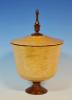


")

