Results 1 to 15 of 15

Thread: Stoppered Bottle #3 (Another Experiment)

  1. #1

    Stoppered Bottle #3 (Another Experiment)

    Since I started turning (a little over two years now) I have flirted with hollow forms. While they have not been a "mainstay" of my efforts, I have always had an appreciation of the sweet forms made by people like andy DiPetro, Keith Burns and many others. I mention Andy and Keith specifically because, while I don't feel that this merits comparison to the work of either, the influence of both is immediately apparent. I have always admired Andy's beautiful forms, so "easy on the eye" almost to the point of being relaxing to view. They don't make demands on the mind, but flow so beautifully. Keith's pieces tend to be more sharply focused especially when topped with his "signature" exclamation point finials.

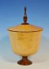
    A while back, David Reed dropped of a couple of pieces of maple burl, one of which was heavily spalted and, on one end, close to rotted. I made a sphere out of the biggest and soundest part of that burl and I still had this piece left. I wanted to try this design but I was (and still am) unsure of it so I did not want to commit anything "precious". I was not sure this burl would even be turnable but it held together OK and even smoothed out fairly nicely.

    "Pre-critique" would include making the finial a bit "lighter" but I'm sure that's just a start. I will most likely try a "real one" of these next. I've got just the right piece of wood for it…

    stoppered_bottle_3_a.jpg


    FWIW it's maple burl (already said that) with a black dyed maple finial. About 5" at the widest point by seven high plus another four for the finial.
    Last edited by David DeCristoforo; 05-27-2012 at 7:30 PM.
    David DeCristoforo

  2. #2
    Join Date
    Jan 2009
    Location
    North Alabama
    Posts
    62
    DD: Maybe one of these days my best turnings can be as good as your experiments. Easy form to look at, makes you want to hold it.
    The Tsunami is Rising
    Roll Tide
    15 And Counting


  3. #3
    Join Date
    Mar 2011
    Location
    Pendleton, KY
    Posts
    803
    That's beautiful. I can't even see where the finial starts. How's that? Is the finial removable? You did a great job on the dye, David.

  4. #4
    Join Date
    Sep 2008
    Location
    Gassaway, WV
    Posts
    1,221
    Nice prototype, I can't imagine the real thing being all that much better.
    Fred

  5. #5
    Join Date
    Jan 2005
    Location
    Goodland, Kansas
    Posts
    22,605
    Beautiful piece DD. Like Fred can't imagine it getting any better.
    Bernie

    Never put off until tomorrow what you can do the day after tomorrow.

    To succeed in life, you need three things: a wishbone, a backbone and a funnybone.


  6. #6
    Join Date
    Jul 2010
    Location
    Sandia Park, NM
    Posts
    1,068
    When I see this I think fluid. It has a wonderful flow, you can't stop your eye from following the line. My eye started at the top of the finial and followed it to the form. Probably backward, but I like it.
    When you approach the lathe you have "the plan", after your first catch you have "the intent".- P. Harbeck

  7. #7
    Join Date
    Aug 2010
    Location
    Wittmann, AZ
    Posts
    2,503
    That's a beautiful experiment David! Excellent form and finish and like Eric, I can't even see where the lid/finial begins and if I didn't know better I'd say it was all one piece. Fabulous wood too!
    "If it is wood, I will turn it."
    vor-tex: any activity, situation, or way of life regarded as irresistibly engulfing.

  8. #8
    That's really cool. Beautiful form, and quite unique. While the finial could possibly be a bit "lighter" I really think it works as is.
    Brian

    Sawdust Formation Engineer
    in charge of Blade Dulling

  9. #9
    David, I really like the flow from the shoulder into the finial, and I like the unique style of the finial - though it could be a bit lighter, and perhaps just a smidgen shorter. The lower portion of the vase form is somewhat different for me, and I am not quite sure about it yet. Beautiful wood, and a great concept. This idea has potential!!

  10. #10
    Join Date
    Jan 2009
    Location
    sLower Delaware
    Posts
    5,464
    Really like the color and the way the curves flow David! I can see the DiPetro and Burns influences.

  11. #11
    David,

    I like the overall design but feel the finial is a bit on the tall side. Shorter and maybe a little thinner I feel would make it a little better.

    Alan
    Last edited by Alan Trout; 05-28-2012 at 12:01 AM.

  12. #12
    Join Date
    Feb 2008
    Location
    Central NC
    Posts
    492
    Love it, has a good beat and is easy to dance to!

    My only nit is the ball on the finial keeps distracting me from an otherwise relaxing view.

    Beta test was a success, looking forward to the final release.

  13. #13
    Join Date
    Oct 2006
    Location
    Harvey, Michigan
    Posts
    20,804
    Very interesting piece David! Beautiful wood and finish! At first I thought the form was too bulbous - but then, that is exactly what DiPetro creates! I do like the design of the finial and while it could be shorter/thinner/whatever... I like how it replicates molten glass!

    I like what you have created here and look forward to seeing the next version!
    Steve

    “You never know what you got til it's gone!”
    Please don’t let that happen!
    Become a financial Contributor today!

  14. Very nice piece, David........love the wood, the color and the blended finial is nice, although I agree with John about just a little shorter and a smidgen thinner near the ball at the top.

    The form itself is nice...........that being said..........on the right side of the form in the pic [this might be camera tricks, because it does not seem the case on the left side of the pic] there seems to be a flat about 1/3 up from the bottom........the curve looks interrupted a bit on that right side [again probably the camera]

    Now the bottom 1/3 of the form I think looks a bit heavy.........I think the curve from the bottom to the 1/3 point up the form should be a bit more tapered and less convex........it looks a bit heavy bottomed to my eye..........this perhaps was your intention, and you carried it out to perfection if it was.............

    A bit more of a taper from that point to the foot would have nailed it in my opinion.........the foot is nicely proportioned for this piece............overall, a very well done piece.
    Remember, in a moments time, everything can change!

    Vision - not just seeing what is, but seeing what can be!


  15. #15
    The finial: Yes, it's too big for the form. I knew that right off. Too tall and too "fat". The ball on top is not optional but that's another story!


    The form: Too "full" at the bottom! Actually my drawing of this has a much narrower "lower bout". This piece of burl was near rotten at the outside. I wanted to put that part at the bottom because it also had the least attractive figure and I was already set on fading the color to almost black at the bottom. But the wood at the bottom is soft and everything was moving around in strange ways. As a result, the whole thing is a bit "cattywampus" and I was afraid that if I took any more wood away it would come apart. On WoW, Paul Hedman mentioned a "bulge" at the bottom and he is correct. It is bulging where the wood was softest. It was "stabilized" a bit with a glue soak.


    Thanx for all the feedback. V2 is underway...
    David DeCristoforo

Posting Permissions

  • You may not post new threads
  • You may not post replies
  • You may not post attachments
  • You may not edit your posts
  •