Page 1 of 4 1234 LastLast
Results 1 to 15 of 47

Thread: "Mosaic"

  1. #1
    Join Date
    Oct 2007
    Location
    Central KY
    Posts
    17,595

    "Mosaic"

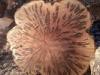
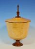
    In my quest to conquer the leaf patination concept, I turned to finish this vase from a large piece of very plain big leaf maple that was still wet. Amazingly, it didn't move any that I could tell. The mouth of the vase spun true through the end of the task. It is 5" wide x 7.5" tall, airbrushed with lemon yellow from the bottom, carmine red and bright red from the top, with black over sprayed, followed by black lacquer. The leaf is copper.

    Kind of a plain vase form, I think, but it was really done as another attempt at the leaf application. Finish is General WTF.

    As always, your comments are welcome.

    MOSAIC 1.jpg MOSAIC 2.jpg

  2. #2
    Join Date
    Dec 2010
    Location
    Willow Spring, NC
    Posts
    487
    Amazing looking piece, sir! The patina is great, but the finish makes the piece. I can not wait to get some free time from work so I can make my way to Woodcraft and pick up some WTF.

    If I had to have a nitpick about this piece, it would be that the bead work and patina are kind of unbalanced with the simplicity of the rest of the piece. Not sure if that makes sense...still looks great!

  3. #3
    Join Date
    Jun 2009
    Location
    Western Maryland
    Posts
    5,548
    What can I say, John...?
    I drink, therefore I am.

  4. #4
    Join Date
    Apr 2009
    Location
    Manassas, Virginia
    Posts
    889
    Hi John,

    The form is spot on. My only desire here would be to have the patination lower, which would show a better contrast between the collar and the surrounding area. It is a beautiful piece.

  5. #5
    Join Date
    Feb 2007
    Location
    Inver Grove Heights, MN
    Posts
    798
    Beautiful color and great form. The copper looks good, but I really think the color and form set this piece apart.

  6. Picking up on Harvey's comment............wonder what a band around the shoulder area might look like with the patination there and a fade from the red to the black at just about where the opening is? That is a fine form John, and you have blended the bead in such a way as it does not interrupt the flow of the curve..............good stuff, counselor!
    Remember, in a moments time, everything can change!

    Vision - not just seeing what is, but seeing what can be!


  7. #7
    Join Date
    Mar 2010
    Location
    Lakeland Florida
    Posts
    2,297
    John, this one is Awesome, from the color, shape, to the patina on the leaf. I really like the design of the leaf, and the beaded top portion really fits the shape of the form. Spectacular job on the airbrushing too. Did your airbrush the dye dissolved in water, or alcohol?
    “I am enough of an artist to draw freely upon my imagination. Imagination is more important than knowledge. Knowledge is limited. Imagination encircles the world.” ~ Albert Einstein

  8. #8
    Nice move, John. Lull us with a nice but not spectactualar piece (the urn) and then pop this on us!

    The finishes you are producing with the new material are like glass. With the subdued figure, this piece might as well be glass . It would be hard to tell if you did not know up front that it is wood.

    I agree with Harvey in that I would like to see the lower bead dropped about an inch, more or less, to allow the leaf to play a bigger role. But that is a personal pref and either way, there is no arguing with this one.
    David DeCristoforo

  9. #9
    Join Date
    Dec 2010
    Location
    Evanston, IL
    Posts
    1,424
    Really like the form, but the finish is the star to me. It does look like glass, and the dye job makes it look like it is lit from within. Nice, nice, nice!

  10. #10
    Home run on this one John. The beading does a very nice job at separating the patina and the rest of the vessel. I also like the dark fade into the patina area. The thing that really stands out on this one (for me) is the continuous curve from the vessel sides ...over the patina area. I like this one as is. Nice work.
    -------
    No, it's not thin enough yet.
    -------

  11. #11
    John,

    I think the leafing turned out much better on this one. I really like the fade. I really like the form. Not sure I like the bead. I will have to think on it for a while. But for sure better.

    Alan

  12. #12
    Join Date
    Jan 2005
    Location
    Goodland, Kansas
    Posts
    22,605
    John that is beautiful. Love the form, color and the patina. I like how the beads provides seperation.
    Bernie

    Never put off until tomorrow what you can do the day after tomorrow.

    To succeed in life, you need three things: a wishbone, a backbone and a funnybone.


  13. #13
    Join Date
    Jan 2008
    Location
    Chicago Heights, Il.
    Posts
    2,136
    Love what you have brought together to make a beautiful piece from a rather plain blank of maple. The use of black to highlight the copper leaf is a real feature. Love the fade and form. Thanks for sharing.
    Member Illiana Woodturners

  14. #14
    Join Date
    Jan 2009
    Location
    sLower Delaware
    Posts
    5,464
    The patination is your best yet IMO John and the form is nice. The rest I will have to contemplate on for a while.

  15. #15
    John, first I want to say that this is just absolutely beautiful. And take this comment for what it' worth, a hayseed truckdriver's opinion. This kind of work always puzzles me as to why you would go to such great lengths to make wood look like something other than wood. I'm sure if I were to hold this in my hands I would be able to see the wood grain, feel the weight (or lack of weight) of it being wood. But my first impression was that it looks like blown glass. Like I said, it's beautiful, but I just have a hang up with covering everything 'woody' about the wood.

Posting Permissions

  • You may not post new threads
  • You may not post replies
  • You may not post attachments
  • You may not edit your posts
  •