Page 1 of 2 12 LastLast
Results 1 to 15 of 16

Thread: Second Hollow Form....first try at a finial

  1. #1
    Join Date
    Sep 2006
    Location
    Lowell,Michigan
    Posts
    372

    Second Hollow Form....first try at a finial

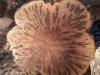
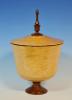
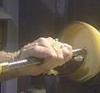
    Here are pics of my second hollow form. Hollowed with a monster articulating arm. It is a maple burl with an african blackwood finial. Hollowed thru a 1" diameter hole.Hd a little trouble getting it hollowed around the hole, until I put the slight raise around the hole. I think it actually improved the look. 5" diameter, 4 1/4" high, 8" overall height with the finial. 4 coats of spray can lacquer finish, then buffed. Used Mylands friction polish on the finial. Someday I hope to get a photo tent to improve my pictures.

    All critiques and comments welcomed. If I don't here what I need to improve on, I can't improve.
    Attached Images Attached Images

  2. #2
    Looks like a keeper to me!!!

  3. #3
    Join Date
    Jan 2005
    Location
    Goodland, Kansas
    Posts
    22,605
    That for a second is well done. Looks the the monster is working well for you.
    Bernie

    Never put off until tomorrow what you can do the day after tomorrow.

    To succeed in life, you need three things: a wishbone, a backbone and a funnybone.


  4. #4
    Join Date
    Dec 2010
    Location
    Willow Spring, NC
    Posts
    487
    The form, wood, and finish on this piece are great...for a second HF or a 100th. If I had to give a critique, I would say that either the size or orientation of the large bulb on the finial makes it look a bit out of balance for me. It kind of looks like two halves of separate finials that were glued together.

    Great job though....a find use for that maple burl.

  5. #5
    The form is great. Perhaps a slightly smaller footprint but this is very close to a "perfect" form.

    As to the finial, there are a number of "schools of thought" there. One of them dictates that the elements of the finial decrease in size from bottom to tip. Another suggests that if you create an imaginary line that continues the sweep of the form all the way to the tip of the finial, all of the finial elements should be tangent to that line. Your finial has not followed either of these. The replication of the form overpowers the rest of the finial elements and immediately pulls they eye to that point rather than letting the eye arrive there by following the "flow" of the form up into the finial.

    I also think your finial has "one too many" elements. I would eliminate the ball, Increase the size of the cove and reduce the size of the "embellishment". Both of these would serve to bring the embellishment down and allow you to elongate the "onion". From there up, you're looking good.
    David DeCristoforo

  6. #6
    Join Date
    Oct 2010
    Location
    Imperial, MO
    Posts
    589
    I think it looks really great, the form is beautiful, well done 2nd.

  7. #7
    The HF looks very nice to me. Very pleasing shape and the finish looks good as well. The finial just looks too "busy". Like David said, I think there are a few too many elements. To my eye, if one or both of the bottom "beads" were eliminated and the larger bead was moved down....it would better balance the finial. I would also concider reducing the overall size (diameter) of the large bead.

    For #2, you did pretty darn good.
    -------
    No, it's not thin enough yet.
    -------

  8. #8
    Join Date
    Oct 2008
    Location
    Fresno, Ca
    Posts
    4,032
    I really like the form. From what I know of finials...the bulb really weights the finial down. Good taper over all and some nice accents.
    Your Respiratory Therapist wears combat boots

  9. #9
    Join Date
    Sep 2009
    Location
    Blairsville GA
    Posts
    2,105
    John...geez, 2nd HF...looking good! The comments from DD and others on the finial are ones I'd suggest as well. I find finials very hard to pull off well, but here's a look at what simplifying this one and stretching a bit would do. I hope you don't mind my taking liberties to edit the finial...
    . 1188_Mod.JPG
    From a proportions standpoint, the finial I've photoshopped could be a bit taller or a bit shorter, but typically most folks work to the notion of the finial being about 2/3 height of form, or form being 2/3 height of finial...and there are always exceptions. This one being about same height as your form, actually looks good to my eye.
    When all is said and done, if you like it, stick with it. There's a lot of canned impressions of what a finial or other form should look like and be designed around, sometimes that gets in way of creative expression.
    Look forward to seeing your work progress...you're off to a super start!
    Last edited by Tim Rinehart; 07-31-2012 at 9:24 AM.
    Laugh at least once daily, even if at yourself!

  10. #10
    Join Date
    Jan 2009
    Location
    sLower Delaware
    Posts
    5,464
    Great finial and great fom for numbers 1 and 2!

  11. #11
    Join Date
    Jun 2009
    Location
    Western Maryland
    Posts
    5,548
    Love the form! Spot on. Yeah, maybe the foot could be smaller, but I've found that just leaves you with less room to sign it! Finials are subjective. If you love it...GREAT! If you don't and want advice, you got some good stuff to work with....
    I drink, therefore I am.

  12. #12
    Join Date
    Nov 2007
    Location
    Fort Pierce, Florida
    Posts
    3,498
    Great HF and the comments on the finial are spot on!
    Retired - when every day is Saturday (unless it's Sunday).

  13. #13
    Join Date
    Sep 2006
    Location
    Lowell,Michigan
    Posts
    372
    Thanks for all the great comments as well as what I could do differently. I think I may have put too many elements in from my experience turning for furniture. Love traditional, victorian, and queen anne. They tend to have quite a few elements.

    DD- Liked your explanation of the sweep for a finial. I did not draw the finial first but just kinda created on the fly. Thanks for your input. I will keep this close when I do another one.

    Tim- thanks for the photoshopped finial. it really gives me a visual what everyone is talking about.

    Again, thanks for all the input.

  14. #14
    Join Date
    Oct 2011
    Location
    Greenville MI
    Posts
    156
    John I do like the finial that Tim Reinhart did with photo shop. But for your first I think it looks great
    Ron

  15. Ditto on what David mentioned........his points about lines that continue the form and the busy-ness of the finial are spot on, and the decreasing size of the elements to keep the flow going to the tip...........with his experience........you would be hard pressed to find a better artist who could share his knowledge with you.........he is in a league with the best!
    Remember, in a moments time, everything can change!

    Vision - not just seeing what is, but seeing what can be!


Posting Permissions

  • You may not post new threads
  • You may not post replies
  • You may not post attachments
  • You may not edit your posts
  •