Looking for some critique on this one. The bowl blank tutorial is not complete but I have been testing the slide show function. thanks for your help.


 [OP]
Member
[OP]
Member
Looking for some critique on this one. The bowl blank tutorial is not complete but I have been testing the slide show function. thanks for your help.
Last edited by Keith Outten; 11-28-2007 at 12:41 PM. Reason: Removed Commercial link
Success is the sum of Failure and Learning
 Moderator

Chris - very nice site! I really like the color scheme you used! Checked out each page - especially all the items you have at the gallery - hope that works out for you! Also, on the bowl page - are you really selling a couple of your bowls for $25 and $29? Hope the web site can help generate some sales for you! I enjoyed it!
Steve
You never know what you got til it's gone!
Please dont let that happen!
Become a financial Contributor today!
Member
Pretty darned nice!
Nice going Chris. That's very well done. Nice turnings too.
What you listen to is your business....what you hear is ours.
[OP]
Member
Thanks Steve, the two bowls that are low priced are not of the quality I now expect of myself. I also am using them to cover different market segments if that makes any sense. By the way, how did you score on the crossword puzzle?Originally Posted by Steve Schlumpf


Success is the sum of Failure and Learning
Member
Very nicely done. My only critique would be that I like a site that fits on the screen and I don't have to scroll sideways to see all the stuff. Maybe I need to up the resolution on my monitor??
Very informative and great pictures.
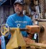
What's in the aquarium in the studio? It's in the main picture but I couldn't
find it in any of the other pics.
I hope to get to a point to do a website some day.
Thanks for sharing
Determined to master the skew.....patience is a virtue
[OP]
Member
Thanks Curt that is quite a compliment comming from you. I appreciate it. How did you score on the crossword?
Success is the sum of Failure and Learning
 Member
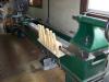
Nice web sight Chris, I like your layout and presentation - and what a job on the pieces of work - very well done! , I also like that lathe you have as well- nice
Brian
[OP]
Member
Darn Doug I never saw it that way before but it does look like an aquarium. Actually it is a triple shelf unit with wood blanks on it. I run a pretty high resolution and I know a lot of people don't but it was just a choice I had to made. Thanks for the comments.
Success is the sum of Failure and Learning
[OP]
Member
Thanks Bill. So what is your score?
Success is the sum of Failure and Learning
 Contributor
Great job Chris!
It looks very professional! Good luck with the business!
A few hours south of Steve Schlumpf
Member
Nice bowls, and nice site, wood be nice to put the size of the turnings in there.
[OP]
Member
William, I will do that. Thanks.
Success is the sum of Failure and Learning
Member
Very nice site Chris...very informative and very well put together. My one and only complaint is some of the fonts are kinda small...darn bifocals. Seems like there was plenty of extra space on those narrative pages that you could have used a larger font without spreading out too much. Easy navigation, I like that! One comment about the links...did you consider having the links open in a new window so your site doesn't get left behind? Sort of like here on SMC. I really like the slideshow tutorial...can't wait till it's finished and I hope to see more. I scored a 93% the first time because of a misspelled word (doh!) and because of 28 down...I think there are two perfectly good answers for that one! Overall a great website!
Working for a living is really starting to interfere with my hobbies!
 Moderator
The one thing that jumped out at me immediately is the "foot marks" instead of proper quotes in the site title.
--
The most expensive tool is the one you buy "cheaply" and often...
 Posting Permissions

 Reply With Quote