Results 1 to 14 of 14

Thread: Need suggestions to improve contrast

  1. #1

    Need suggestions to improve contrast

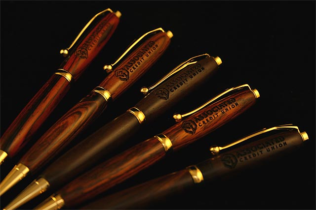
    I'm rastering pens made of cocobolo with a customer's logo. I've always had a problem getting much contrast on darker woods. Sometimes using a combination of raster plus a vector outline helps. I thought I'd solicit experience and wisdom from this group on improving the contrast. I'm using a 45 watt Epilog Legend 24TT. My typical raster settings for pens are 400 DPI, 50-60 speed and 100 power. With cocobolo and other dark woods I've tried 600 DPI with no visible improvement. I've tried combinations of speed / power of 50/100, 40/100, 30/75 and 20/50 (trying not to cut too deep so as not to get to the brass sleeve).

    The engraving looks just fine except that there is virtually no contrast with the surrounding surface. I'm trying to avoid filling or otherwise painting the engraved logo to save my time and the customer's money.

    Any suggestions or comments would be appreciated.

    Paul Proffitt
    Suwanee, GA
    Epilog Legend 24TT - 45 Watt, Corel 12, Illustrator CS and a few (OK maybe more than a few) other shop tools.

  2. #2
    Join Date
    Aug 2006
    Location
    Rio Rancho, NM
    Posts
    2,568
    Paul, from my experience, there isn't any way to improve the contrast on dark woods, other than color-filling with black. Since the laser process is basically a burning process and turns the wood dark, you aren't going to be able to improve the contrast with speed/power adjustments--it's the nature of the process.

    Wish I could be more encouraging.

    Nancy (53 days)
    Nancy Laird
    Owner - D&N Specialties, Rio Rancho, New Mexico
    Woodworker, turner, laser engraver; RETIRED!
    Lasers - ULS M-20 (20W) & M-360 (40W), Corel X4 and X3
    SMC is user supported. http://www.sawmillcreek.org/donate.php
    ___________________________
    It's nice to be important, but it's more important to be nice.

  3. #3
    Nancy, that was very helpful if not encouraging. I'll go back to my vectoring the outline of the graphic to get at least an edge with more contrast. I've found that vectoring the edge, even in light woods like maple and olive wood, will substantially improve the contrast. I typically use a setting of 100 speed and 20 or 15 power (300 or 400 DPI) and usually leave the frequency set at the driver's default of 2500. I may experiment on a sample cocobolo piece with much lower frequency settings (300 to 500) to see if that works without burning too deep.

    Paul Proffitt
    Epilog Legend 24TT 45 Watt, Corel 12, Illustrator CS and numerous other gadgets and gizmos.

  4. #4
    Join Date
    Dec 2004
    Location
    Long Island, NY
    Posts
    256
    I don't know if this will help with pens, but sometimes when I'm doing something flat where I need more contrast, I'll raster it a second time with lower power and faster speed... it seems to burn the already rastered parts a little bit better.

  5. #5
    Barbara, I should have tried that already, but forgot. I have done that before. I just don't have a good idea of how far to go with the first versus the second run to get the optimal contrast versus depth. I'll give it a go later today.

    I did try setting the vector outline at different settings. Not much, if any, discernible improvement. Setting I tried were 100 power at 20 speed at 400 PPS and 75 power at 15 speed at 400 PPS. Didn't see much difference in 400 PPS frequency versus the original 2500 PPS.

  6. You could try to brush on some laser toner (from a laser printer).

  7. #7
    I am trying my best not to have to introduce anything to color the engraving, just do the engraving itself. Mostly a time issue.

    My final settings after trying numerous combinations of single and multiple passes of raster only and numerous combinations of raster and vector was as follows:

    Combination of raster and vector in one run at 400 DPI
    Raster settings - Speed 35, Power 100
    Vector settings - Speed 50, Power 15, PPS 400

    Maybe that will help someone else get a starting point and improve from there.

    Paul Proffitt
    Epilog Legend 24TT 45 watt, Corel 12, Illustrator CS, and other stuff

  8. #8
    Paul

    With the limited thickness of the pen wall it is not possible to get a sufficient burn to achieve the contrast you are seeking. On pens (only darker woods) I use black paste shoe polish for a fill and in wiping it off polish the finish. This looks good, provides the contrast you desire and takes almost no time.
    Last edited by Mike Null; 10-30-2007 at 5:27 AM. Reason: addition
    Mike Null

    St. Louis Laser, Inc.

    Trotec Speedy 300, 80 watt
    Gravograph IS400
    Woodworking shop CLTT and Laser Sublimation
    Dye Sublimation
    CorelDraw X5, X7

  9. #9
    I haven't tried the black shoe polish yet, but I might give that a go. As a follow-up here's a picture of some of the finished engraving on the client-made pens (all are cocobolo). All comments and suggestions for improvement are welcome.


  10. #10
    Thes pens are almost the color of the regular rosewood pens.
    In addition to the paste shoe polish, i use the liquid black shoe polish . It is much faster, less messier and more pronounced.
    abdul

  11. #11
    Paul,

    I have used gold "rub-n-buff" on both coco bolo and rose wood pens it gives a nice contrast. Just make sure the wood is sealed well or use tape as a mask so that the rub-n-buff does not get in the grain.

    Mark

  12. #12
    Join Date
    Aug 2006
    Location
    Rio Rancho, NM
    Posts
    2,568
    Paul, I've also used gold and silver acrylic on dark-wood pens--matching the fittings. But yes, make sure the wood is sealed well, or you'll have little gold or silver spreckles all over the barrel, not just where you want them. DAMHIKT!!

    Nancy (52 days)
    Nancy Laird
    Owner - D&N Specialties, Rio Rancho, New Mexico
    Woodworker, turner, laser engraver; RETIRED!
    Lasers - ULS M-20 (20W) & M-360 (40W), Corel X4 and X3
    SMC is user supported. http://www.sawmillcreek.org/donate.php
    ___________________________
    It's nice to be important, but it's more important to be nice.

  13. #13
    Paul - there was someone a couple months back that told me to raise my DPI to 1200 for dark woods - it allows higher speeds, but the overlapping dots will cause more charring of the wood. Not sure if it will help with Cocobola (my favorite for turning BTW) - but if you get a chance to try - give it a shot and let me know if it helps. I know it helps with Alder...
    Steve Beckham

    Epilog Mini 24 with 45 Watt, Ricoh GX 7000 Sublimation, Corel X3, Corel X4 and PhotoGrav, Recently replaced the two 'used' SWF machines with brand new Barudans.

  14. #14
    Steve

    You're right about raising the dpi to increase contrast but pens walls are very thin and you can burn through them quite easily. I'm not sure you'd gain anything and the black polish works without risk.
    Mike Null

    St. Louis Laser, Inc.

    Trotec Speedy 300, 80 watt
    Gravograph IS400
    Woodworking shop CLTT and Laser Sublimation
    Dye Sublimation
    CorelDraw X5, X7

Similar Threads

  1. Finish suggestions for mahogany
    By Ralph Wiggum in forum Project Finishing
    Replies: 12
    Last Post: 10-23-2007, 4:31 PM
  2. Suggestions for toning down grain contrast?
    By Paul Appleby in forum Project Finishing
    Replies: 6
    Last Post: 04-05-2007, 9:58 PM
  3. Suggestions for cushions
    By Kyle Stiefel in forum General Woodworking and Power Tools
    Replies: 5
    Last Post: 03-06-2007, 12:40 PM
  4. Dado blade suggestions
    By Julio Navarro in forum General Woodworking and Power Tools
    Replies: 17
    Last Post: 06-08-2006, 8:36 AM
  5. Gun suggestions?
    By Tommy Curtiss in forum General Woodworking and Power Tools
    Replies: 1
    Last Post: 03-16-2006, 9:31 AM

Posting Permissions

  • You may not post new threads
  • You may not post replies
  • You may not post attachments
  • You may not edit your posts
  •